 It occurred to me that the number of articles I was reading on weekly basis was growing at an incredible rate. In fact, I don’t think I’ve ever consumed as much new information on a regular basis in my life. Not even in my university days when trolling through the stacks for the best and most insightful articles was a regular occurrence did I read so much. If you’re reading this from Facebook, LinkedIn or Stumbleupon, you probably know what I mean.
On any given day, I’m getting smart tips from social media gurus, insights from those in the communications or marketing fields. Thought provoking pieces from political pundits, updates and comments on Facebook, not to mention the range of topics I cover when playing on Pinterest or Stumbleupon. In addition to my own pursuits, my friends are regularly sharing links to interesting articles with me too. I don’t think I’m alone in these habits.
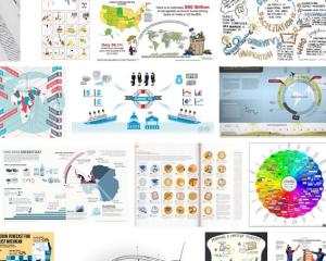
It should come as no surprise then that we are seeing some interesting trending towards the popularization of information graphics. The general idea of an information graphic is to deliver multiple messages in a snapshot. They are hardly a new concept, but the mechanisms for creating them are more readily available now. Today, all you have to do to create an information graphic is import the content you have in mind into a program and tada, an information poster is produced.
I work in an organization that has thousands of people operating out of different locations. Its my job to get messages to them on a wide range of topics and in a manner that they will actually digest. Information graphics seem like the perfect solution. All the best parts of a poster, but also a way to convey multiple messages. What could be better? Great idea right, well, sort of.
Last week a friend of mine sent me an information graphic of her resume. I was fascinated to see how these documents worked in action when I knew the content. The resume looked ok, but there was one problem. Her new resume didn’t come anywhere close to demonstrating how smart or experienced she was. In fact, if anything, it made her seem more junior. Taking her 20 plus years of brilliance and distilling it down to a couple of awards and statistics that at best was of passing interest. I started looking around for better versions. I checked out a range of information graphics from those meant to impart pearls of wisdom on social media to those intended to act as an organizational dashboard. When they work, they are brilliant, clear, concise and exactly what you need when you’ve got a lot to say in a little bit of time. The problem is, for the most part, they don’t work well and that’s because they are created on the principle that you can apply a one size fits all mind set to communications.
After all of these years of talking about getting more effective at the knowledge transfer process, it’s almost as if we now seem intent on turning information back into data. That’s effectively what most of these information graphics do. They obliterate relevant information and highlight irrelevant statistics. In one instance one of the stats that showed up was the number of cups of coffee the applicant required to get started in the morning. In my personal favorite, the creator of the graphic effectively argued that the reason small businesses should embark on social media was because everyone else was doing it. Really? Are we in elementary school? I’m sure I could come up with more sound reasons, but then those reasons might not have convenient numbers.
To be clear, its not that I think information graphics are a bad idea, on the contrary, they can be brilliant. What I think is that like any communications medium, you need to use your brain. You can’t just stick your information into a formula and get good results like magic. Communications has always been about understanding your audience, knowing your objectives and speaking to them clearly. How does a one size fits all solution do that effectively?
I’d love to hear from you if you know of some examples of brilliant information graphics. Drop me a line on the blog or LinkedIn.
Lessons Learned
- It isn’t better to look good than to be good. Don’t use statistics where a sentence would be clearer and pie charts where a picture would do the job better.
- No matter what medium you use to communicate, you have to keep your skills as a communicator in the forefront. If you want to use clever graphics to deliver a message, talk to a professional about designing one that meets your particular needs.
- Take a note of those who have used information graphics effectively and find out how they did it. Canadian Blood Services has done a brilliant job of it for years.
Excellent article! I think people have become too complacent with the outer appearance of things, rather than putting more thought into the content. While it is important to have nice packaging, what’s inside is what matters most.
I couldn’t agree more. If the contents aren’t right, there really is no point behind clever graphics.