I was thinking about pictures the other day, pictures of scones to be precise and wondering how I wanted to set the scene for them. What props would work, what lighting would be good, how would I convey quality? It struck me that I was more worried about how the food would look than most people are about the pictures of themselves they post. They weren’t even my scones.
I’m even worst when it comes to people. I will spend ages thinking about how I want board members, senior management or the CEO viewed. I have destroyed images of senior management I thought were in poor taste or inconsistent with the corporate brand. I’ve also used funny pictures of the CEO to convey warmth and humour to staff. The point is, some thought should go into each photo and how it’s used. What is the objective, what message is being conveyed, what audience are you talking to?
I have watched with some curiosity and a little dismay as coquettish, slightly boudoir, images have shown up on LinkedIn. I have a sense of humour, so while I often find them funny they also make me a touch uncomfortable because they really don’t belong on LinkedIn. I can’t help but wonder what the person is trying to convey in a business setting. Here are some tips for what to avoid.
The Boudoir Photo: If there is a feather boa in the image, then don’t use the image for your professional shot. It’s not that I have anything against feather boas but what they call to mind are things like, the Rocky Horror Picture Show and exotic dancers. Unless you are selling costumes or polls for dancing, lose the feathers.
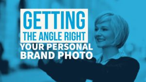
The Angry Woman: Do you know what happens when you hold your phone in your hand and look down on it in concentration as you take a selfie? You get the Angry Man/Woman photo. It’s a photo of your nostrils, always attractive, while you look down your nose at the viewer. How appealing. If you are smiling then it can look creepy or patronizing. If you’re not smiling, you have the perfect Angry Man. If you’re going to use a selfie, lift your hand to head level or slightly higher.
The Location Shot: I’ve seen quite a few “professional” shots of young men at the beach lately. The attire is what you might expect for a beach photo, shorts, and shades. In some really interesting branding choices, the person is not wearing a shirt. The individual is often trying to give me advice. I think they are trying to say, “Look at me, I’m so successful I now live the good life.”
What I see is a guy too inexperienced to know what’s appropriate. Here’s my advice, if it’s good enough for a restaurant, then it’s good enough for your professional photo. No shirt, no shoes, no service. Extend the thought to include that there should be no shorts or shades in a professional photo.
Where’s Waldo: The Where’s Waldo photo comes in many forms. It’s can be anything from a family photo or a corporate shot. What they have in common is that there’s more than one person visible. So now the viewer gets to choose. Is it the guy on the left or right? Where is the subject? If it’s a man and woman in the photo, the poster’s name might give you a clue, providing their name isn’t gender neutral like Kelly, Beverly or Pat. Even if the name does make it clear, why is the other person in the photo? What is the unstated message?
Eye Spy: These are among my personal favourites. It’s really about not wanting to include a photo of yourself so you use one where you are so small that the viewer can’t quite see you. It’s the photo of the Grand Canyon and you’re off to the side like a perspective reference. This is a useless shot and tells the viewer you don’t really get the point of including a photo.
I could go on, the photo with plunging neckline for men or women is a no go, as is the open mouth speech shot. The point is, decide what you are trying to convey about your personal brand with a photo. Do you want to earn trust, their time or just their attention?
I get that people don’t want to be sheep. I appreciate wanting to do something a little different, you can do that without becoming goofy. Above all else, a professional photo is supposed to make you look like a professional, or at least it shouldn’t make you look like a felon.
Some quick tips for good shots.
- Use natural lighting. This does not mean squinting into the sun, but it does mean avoiding unnecessary shadows or that shiny-face look that can happen in night shots. Not to mention the red eyed demon that comes with poor lighting.
- Focus on the chest up or just head and shoulders. This means you will be the central focus of the image.
- Think about how you want to be seen by a client, not your buddies.
- Use a professional photographer. When chosen well, they are worth every penny. Consider it an investment in yourself.
How did you choose your photo and why? Do you think your photo matters to your brand? Have you ever seen a photo and thought…what were they thinking? Have you ever seen a photo and thought, brilliant!
Image courtesy of stockimages/FreeDigitalPhotos.net